Appearance
04 — 数据可视化基础(Data Visualization for Machine Learning)
"一图胜千言"——在机器学习中,可视化是理解数据、诊断模型、沟通结果的核(kernel /ˈkɜːrnl/)心技能。本章以 Matplotlib 为主线,覆盖 ML 全流程中的高频图表类型和实用技巧。
"A picture is worth a thousand words" — In ML, visualization is essential for understanding data, diagnosing models, and communicating results. This chapter covers Matplotlib's core API and ML-focused chart types.
配套代码(Companion code):code/visualization_demo.py
bash
# 运行生成所有图表(Run to generate all plots)
python ai/01-overview/code/visualization_demo.py
1. Matplotlib 哲学(Philosophy)
Matplotlib 有两个核心对象:
| 对象 | 含义 | 类比 |
|---|---|---|
| Figure | 整个画布(Canvas) | 一张白纸 |
| Axes | 画布上的一个子图(Subplot) | 纸上的一块绘图区域 |
python
import matplotlib.pyplot as plt
import numpy as np

# 核心模式:先创建 Figure + Axes,再在 Axes 上绘制
fig, ax = plt.subplots(figsize=(8, 5))  # 一个 Axes
fig, axes = plt.subplots(2, 3) # 2×3 网格,axes.shape = (2, 3)黄金法则:所有绘图操作都在
ax上完成(OO-style),而非plt(Pyplot-style)。 OO-style 更清晰、更灵活,适合复杂布局。
2. 核心 API(Core API)
2.1 Figure 与 Subplots
python
# 单图
fig, ax = plt.subplots(figsize=(8, 5))

# 多子图
fig, axes = plt.subplots(2, 2, figsize=(10, 8))
ax1, ax2, ax3, ax4 = axes.ravel()  # 展平为 1D 数组

# 共享坐标轴
fig, (ax1, ax2) = plt.subplots(1, 2, sharey=True)
subplots 返回 (Figure, Axes) 元组。figsize=(width, height) 单位是英寸。
2.2 线形、颜色与标记(Line Styles, Colors & Markers)
python
ax.plot(x, y,
        color="blue",        # 颜色:'blue', '#1f77b4', (0.1, 0.2, 0.5)
        linestyle="--",      # 线形:'-'(实线), '--'(虚线), ':'(点线), '-.'(点划线)
        linewidth=2,         # 线宽
        marker="o",          # 标记:'o'(圆), 's'(方), '^'(三角), 'x'(叉)
        markersize=6,        # 标记大小
        alpha=0.8,           # 透明度
label="Train Loss") # 图例标签快捷方式:fmt = "[color][marker][line]",例如 "bo--" = 蓝色圆点虚线。
2.3 标签、标题、图例与网格
python
ax.set_xlabel("Epoch")           # X 轴标签
ax.set_ylabel("Loss")            # Y 轴标签
ax.set_title("Training Curve")   # 标题
ax.legend()                      # 显示图例(需要 plot 时指定 label)
ax.grid(True, alpha=0.3)         # 网格线
ax.set_xlim(0, 100)              # X 轴范围
2.4 保存图片
python
fig.savefig("output.png",
            dpi=150,             # 分辨率(dots per inch)
            bbox_inches="tight", # 裁剪空白
facecolor="white") # 背景色(默认透明)| 参数(parameter /pəˈræmɪtər/) | 作用 |
|---|---|
dpi | 输出分辨率,印刷级 ≥300,屏幕用 150 |
bbox_inches="tight" | 自动裁剪周围空白区域 |
transparent=True | 透明背景(适合嵌入(embedding /ɪmˈbedɪŋ/)演示文稿) |
3. 常用图表类型(Common Chart Types)
3.1 折线图(Line Plot)— 训练曲线
折线图最适合展示连续变化趋势。ML 中最经典的场景就是绘制训练/验证损失曲线。
python
epochs = np.arange(1, 51)
train_loss = 2.0 / (1 + 0.08 * epochs) + 0.05 * np.random.randn(50)
val_loss   = 2.0 / (1 + 0.06 * epochs) + 0.08 * np.random.randn(50)

fig, ax = plt.subplots(figsize=(8, 5))
ax.plot(epochs, train_loss, "b-", linewidth=2, label="Train Loss")
ax.plot(epochs, val_loss, "r--", linewidth=2, label="Validation Loss")
ax.set_xlabel("Epoch"); ax.set_ylabel("Loss")
ax.set_title("Training & Validation Loss Curve")
ax.legend(); ax.grid(True, alpha=0.3)
fig.savefig("line_curve.png", dpi=150, bbox_inches="tight")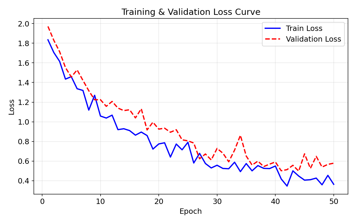
诊断要点:
- 两条曲线差距大 → 过拟合(overfitting /ˈoʊvərˈfɪtɪŋ/)(Overfitting)
- 验证集不再下降 → 早停(Early Stopping)
- 损失震荡剧烈 → 学习率过大(Learning rate too high)
3.2 散点图(Scatter Plot)— 特征分布
散点图展示两个特征之间的关系,常用于分类(classification /ˌklæsɪfɪˈkeɪʃən/)问题的数据探索。
python
fig, ax = plt.subplots(figsize=(7, 6))
ax.scatter(x0, y0, c="steelblue", label="Class 0", alpha=0.7, edgecolors="k")
ax.scatter(x1, y1, c="coral",     label="Class 1", alpha=0.7, edgecolors="k")
ax.set_xlabel("Feature 1"); ax.set_ylabel("Feature 2")
ax.set_title("2D Feature Space (Binary Classification)")
ax.legend(); ax.grid(True, alpha=0.3)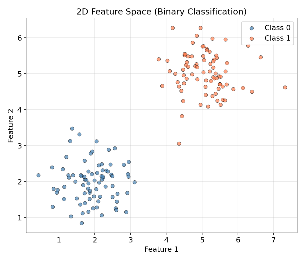
散点图可以快速判断:类别是否线性可分?是否存在异常点?特征是否需归一化(normalization /ˌnɔːrmələˈzeɪʃən/)?
3.3 条形图(Bar Chart)— 模型对比
条形图适合离散类别间的数值比较,如模型精度对比。
python
models = ["Logistic\nRegression", "Decision\nTree", "Random\nForest", "SVM", "MLP"]
accuracies = [85.2, 78.6, 92.3, 88.1, 91.0]
colors = ["#4C72B0", "#55A868", "#C44E52", "#8172B2", "#CCB974"]

fig, ax = plt.subplots(figsize=(8, 5))
bars = ax.bar(models, accuracies, color=colors, width=0.6)
for bar, acc in zip(bars, accuracies):
    ax.text(bar.get_x() + bar.get_width()/2, bar.get_height() + 0.5,
            f"{acc}%", ha="center", va="bottom", fontweight="bold")
ax.set_ylabel("Accuracy (%)"); ax.set_title("Model Comparison")
ax.set_ylim(0, 100); ax.grid(axis="y", alpha=0.3)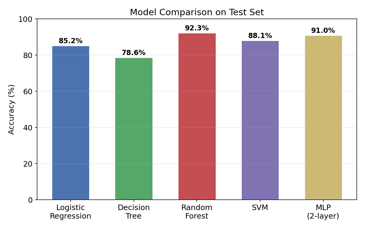
3.4 直方图(Histogram)— 特征值分布
直方图展示单个特征的数值分布形态。
python
fig, ax = plt.subplots(figsize=(8, 5))
ax.hist(age, bins=30, color="steelblue", edgecolor="white", alpha=0.8, density=True)
ax.set_xlabel("Age"); ax.set_ylabel("Density")
ax.set_title("Feature Distribution (Age)")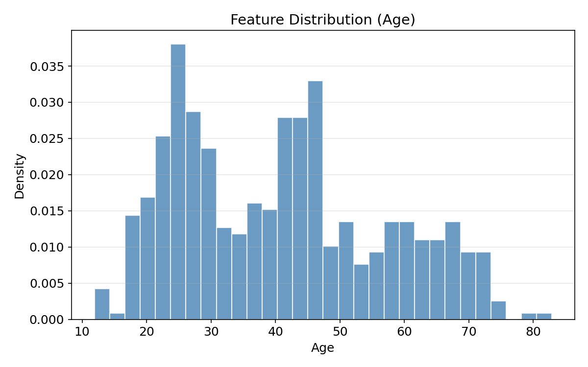
直方图揭示:数据是否偏斜(Skewed)?是否存在多峰(Multimodal)?是否需对数变换?
3.5 热力图(Heatmap)— 混淆矩阵 & 相关矩阵
热力图用颜色编码矩阵数值,ML 中最常用在混淆矩阵和相关系数矩阵。
python
# 混淆矩阵
cm = np.array([[85, 10], [8, 97]])
fig, ax = plt.subplots(figsize=(6, 5))
im = ax.imshow(cm, cmap="Blues", aspect="auto")
for i in range(2):
    for j in range(2):
        ax.text(j, i, str(cm[i, j]), ha="center", va="center", fontsize=16)
fig.colorbar(im, ax=ax)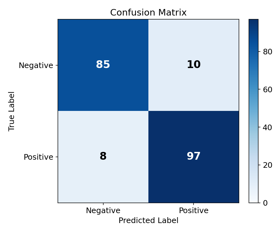
python
# 相关系数矩阵
cov = np.corrcoef(data.T)  # Pearson 相关系数
fig, ax = plt.subplots(figsize=(7, 6))
im = ax.imshow(cov, cmap="RdBu_r", vmin=-1, vmax=1)
for i in range(k):
    for j in range(k):
        ax.text(j, i, f"{cov[i, j]:.2f}", ha="center", va="center")
fig.colorbar(im, ax=ax, label="Pearson r")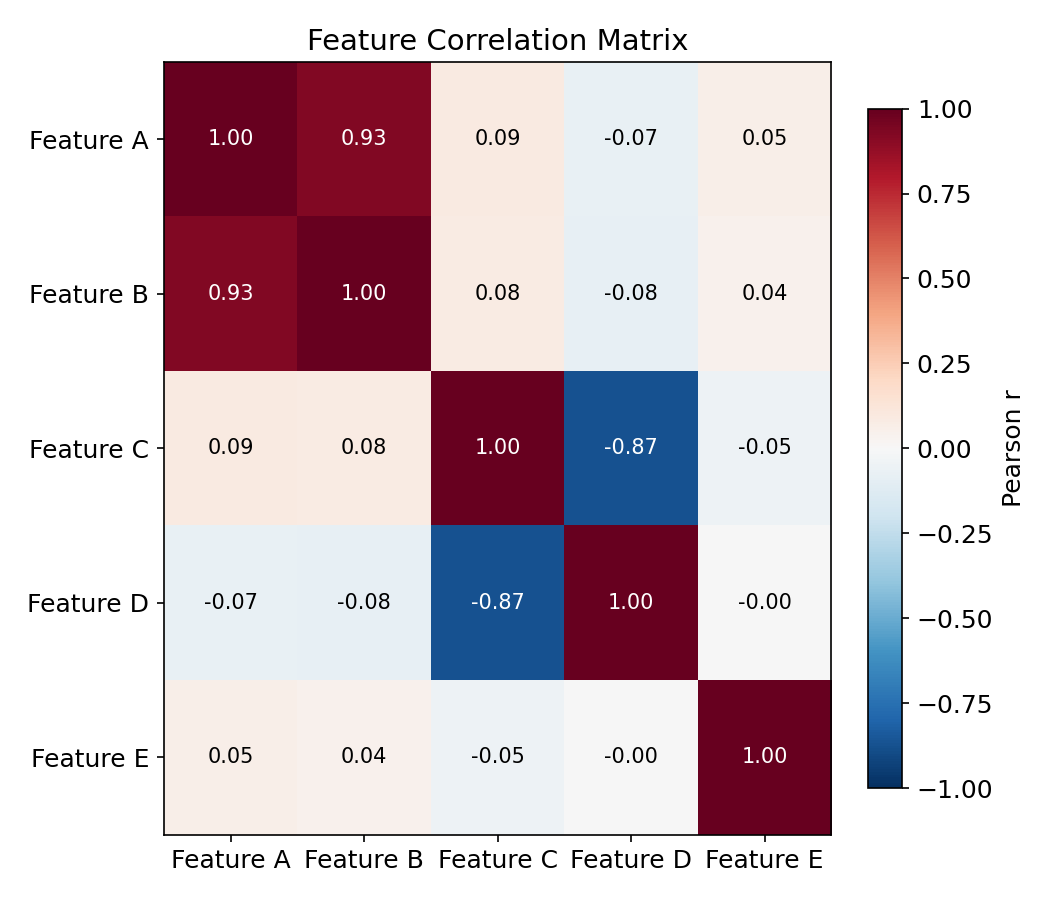
| 色彩映射(Colormap) | 适用场景 |
|---|---|
Blues / Purples | 渐变数值(如混淆矩阵计数) |
RdBu_r | 正负对称(如相关系数 -1 ~ +1) |
viridis / plasma | 感知均匀,通用首选 |
hot / coolwarm | 温差效果,适合强调极端值 |
4. ML 专用可视化(ML-Specific Visualizations)
4.1 ROC 曲线与 AUC
ROC 曲线(Receiver Operating Characteristic)从左上到右下绘制真正率(TPR) vs 假正率(FPR),对角线对应随机(stochastic /stəˈkæstɪk/)猜测(AUC = 0.5)。AUC(Area Under the Curve)衡量模型区分正负类的能力。
| AUC 范围 | 含义 |
|---|---|
| 0.9 ~ 1.0 | 优秀(Excellent) |
| 0.8 ~ 0.9 | 良好(Good) |
| 0.7 ~ 0.8 | 一般(Fair) |
| 0.5 ~ 0.7 | 较差(Poor) |
python
fig, ax = plt.subplots(figsize=(7, 6))
ax.plot(fpr1, tpr1, "b-", linewidth=2, label=f"Model A (AUC = {auc1:.3f})")
ax.plot(fpr2, tpr2, "r--", linewidth=2, label=f"Model B (AUC = {auc2:.3f})")
ax.plot([0, 1], [0, 1], "k:", alpha=0.5, label="Random (AUC = 0.5)")
ax.set_xlabel("False Positive Rate (FPR)"); ax.set_ylabel("True Positive Rate (TPR)")
ax.set_title("ROC Curve Comparison"); ax.legend(loc="lower right"); ax.grid(True, alpha=0.3)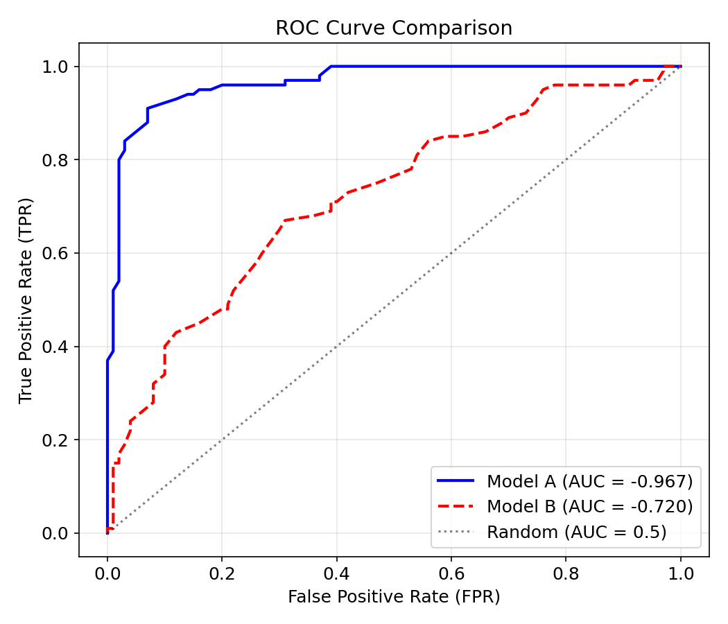
解读:曲线越贴近左上角,模型性能越好。当 AUC = 1.0 时模型完美,AUC = 0.5 时等于随机猜测。
4.2 归一化前后对比
特征归一化(Feature Normalization)是 ML 数据预处理的关键步骤。Min-Max 归一化将数据缩放到 [0, 1] 区间:
python
raw = np.random.exponential(scale=2, size=(500, 2))
normed = (raw - raw.min(axis=0)) / (raw.max(axis=0) - raw.min(axis=0))

fig, (ax1, ax2) = plt.subplots(1, 2, figsize=(12, 5))
ax1.hist(raw[:, 0], bins=25, alpha=0.7, label="Feature 1")
ax1.hist(raw[:, 1], bins=25, alpha=0.7, label="Feature 2")
ax1.set_title("Before Normalization")
ax2.hist(normed[:, 0], bins=25, alpha=0.7, label="Feature 1")
ax2.hist(normed[:, 1], bins=25, alpha=0.7, label="Feature 2")
ax2.set_title("After Min-Max Normalization")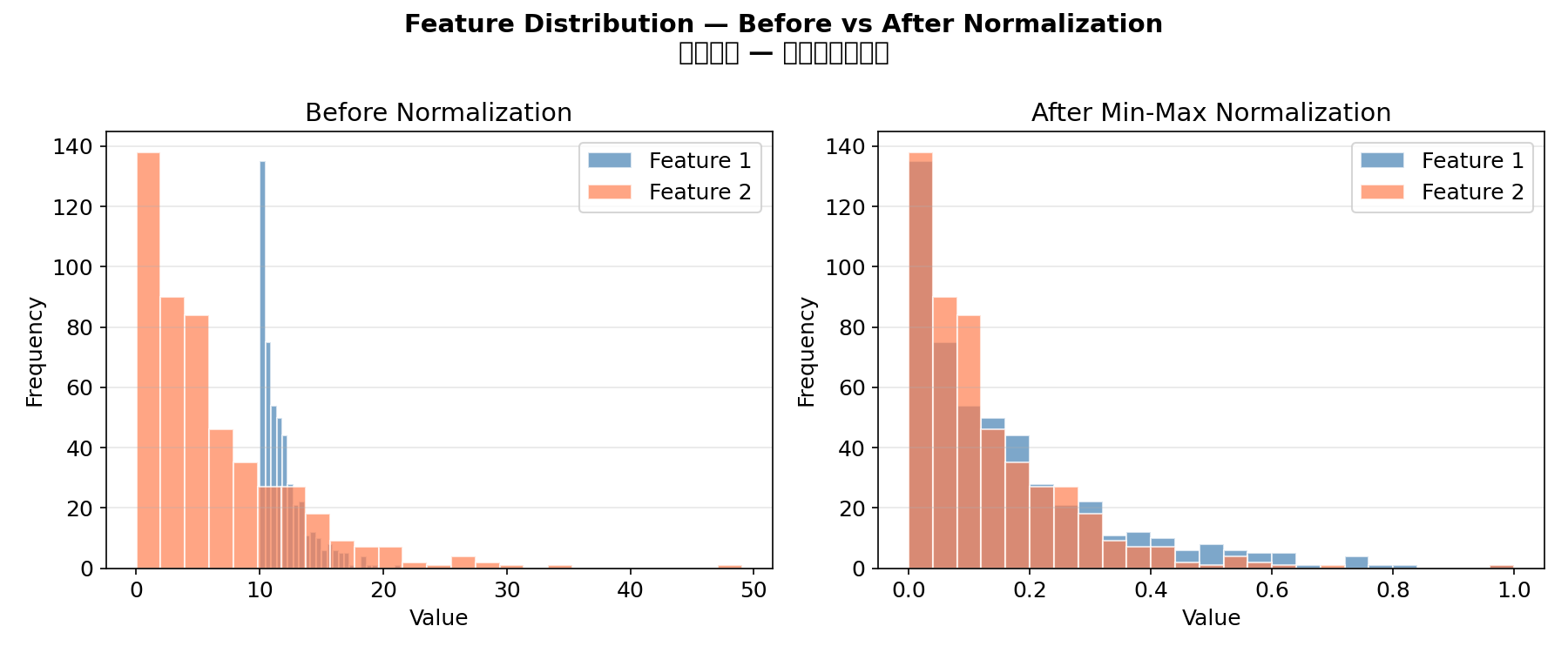
归一化必要性:基于距离的模型(KNN、SVM、K-Means)和梯度(gradient /ˈɡreɪdiənt/)下降方法(神经网络)对特征尺度敏感。决策树和随机森林则不受影响。
4.3 学习曲线(Learning Curve)
除损失曲线外,还有学习曲线(模型性能 vs 训练样本数),用于诊断偏差-方差问题:
| 模式 | 诊断 |
|---|---|
| 训练精度低 + 测试精度低 | 高偏差(欠拟合(underfitting /ˈʌndərˈfɪtɪŋ/))→ 增加模型复杂度 |
| 训练精度高 + 测试精度低 | 高方差(过拟合)→ 增加数据/正则化(regularization /ˌreɡjələraɪˈzeɪʃən/) |
5. 颜色与样式最佳实践(Style Best Practices)
5.1 推荐配色方案
python
# 学术论文常用配色
COLORS = ["#4C72B0", "#55A868", "#C44E52", "#8172B2", "#CCB974", "#64B5CD"]

# 灰度兼容(打印友好)
GRAYSCALE = ["#000000", "#666666", "#999999", "#BBBBBB", "#DDDDDD"]
5.2 易读性检查清单
- [x] 坐标轴标签自带单位或用文字说明
- [x] 图例清晰,不与数据点重叠
- [x] 字体足够大(标题 ≥14pt,标签 ≥12pt)
- [x] 线宽 ≥2,标记 ≥6(确保可见)
- [x] 使用
grid(alpha=0.3)帮助定位数值 - [x] 保存时指定
dpi=150以上
6. 进阶技巧(Advanced Tips)
6.1 双 Y 轴
python
ax1.plot(epochs, loss, "b-")
ax2 = ax1.twinx()                      # 共享 X 轴
ax2.plot(epochs, lr, "r--")
6.2 子图布局
python
# 不均匀布局
gs = fig.add_gridspec(2, 2, height_ratios=[2, 1], width_ratios=[1, 1])
ax1 = fig.add_subplot(gs[0, :])   # 顶部占满两列
ax2 = fig.add_subplot(gs[1, 0])   # 左下
ax3 = fig.add_subplot(gs[1, 1])   # 右下
6.3 注释与箭头
python
ax.annotate("Overfitting starts here",
            xy=(20, 0.8), xytext=(30, 1.5),
            arrowprops=dict(arrowstyle="->", color="red"))
6.4 文本渲染
python
ax.text(0.02, 0.98, f"AUC = {auc:.3f}", transform=ax.transAxes,
        ha="left", va="top", fontsize=12, bbox=dict(boxstyle="round", fc="wheat", alpha=0.5))
transform=ax.transAxes 使用相对坐标(0~1),随 Axes 缩放。